The prominence of the market year average (MYA) price in the Farm Bill made me wonder how many people actually know how it is determined or what it even is. The MYA price is something that finds its way into many economic analyses, but is probably used with little thought given to the details of its construction or what it really represents. I know I have used it frequently without ever giving it much thought. However, tying a government payment to it got my attention so I decided to investigate the details of the calculation a bit.
MYA Prices and the Farm Bill
Although there are many questions yet to be answered about the new farm bill, it is clear that the market year average (MYA) price will play a big role in determining the payments that are made under any option that farmers select. For example, the formula used to calculate payments under the PLC program compares the MYA price to reference prices. The reference prices are $3.70, $8.40, and $5.50 for corn, soybeans, and wheat respectively. When the MYA price for corn is less than the reference price, payments are made based on the FSA farm yield and the difference between the MYA and the reference price.
The calculation under the two ARC programs is a bit more complex, but the MYA still plays a central role. In the case of ARC County the payment depends on the current year county yields, the current year MYA, and benchmark revenue (determined by Olympic averages of recent county yields and the MYA prices).
The marketing year for most crops overlaps calendar years. For instance, the U.S. 2014 corn and soybean marketing years run from September 1, 2014 to August 31, 2015. For wheat, the 2014 marketing year runs from June 1, 2014 to May 31, 2015. This is why you often see crop years referenced in tables or charts as 2014/15.
Calculating a MYA Price
The calculation of the MYA price is the culmination of major data collection effort by the National Agricultural Statistics Service. I’m going to focus on corn, but the process is similar for most of the major grain crops. There are some significant differences in the way that NASS estimates the MYA price for some of the fruit, nut, meat, and other products. For those of you with time on your hands, many of the details associated with this effort can be found in this 285 page report.
The process involves NASS conducting a monthly survey from a sample of grain and oilseed buyers from approximately 1,900 mills and elevators. These buyers are selected from probabilistic sampling procedure meaning that not every buyer will be sampled, but in theory every buyer could be sampled. The buyers are selected in a way that allows NASS to create a state-wide and nationally representative estimate of the prices received. The survey is voluntary and requests that buyers report the total amount of grain purchased during the specified period and the total amount paid for the grain. This allows them to estimate a price per unit after adjusting and cleaning the data according to detailed protocols.
NASS makes a prior month estimate which considers all grain bought in the prior month and a mid-month estimate which asks about grain bought from the beginning to the middle of the current month. This is apparently how a November corn price estimate can be made before November is over.
NASS reports a statewide average price for most states that are important to production of a commodity. These monthly state estimates are then weighted by volume marketed to arrive at a preliminary estimate of national average price. Chad Hart at Iowa State provides a good discussion of the process used to develop the weights here and a nice easy to use and well documented spreadsheet to estimate the MYA price here. The Economic Research Service models for corn, wheat, and soybean MYA forecasts (which some of the ISU model is based on) are available here.
MYA Prices on the Farm
The MYA seeks to provide a price that is reflective of the average price that farmers across the U.S. received for the crops that they sell. While this sounds nice, for an individual farmer the price may or may not reflect the prices that they actually received. A simple analogy might be the Census Bureau’s report of new single family home sales. The average for the entire U.S. in 2013 was $324,500 which would seem like a bargain if you lived in the Northeast where the average was 469,900. If however, you live in the South where the average was $292,600, it probably seems pretty high.
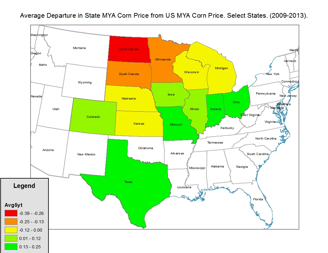
Such geographic variation is readily apparent in the data. In 2013 the U.S. MYA corn price was $4.46 per bushel. Corn Belt states such as Iowa, Illinois, Indiana, and Nebraska all had MYA prices within $0.06 of the national price. At the extremes, North Dakota was $0.55 lower at $3.91 per bushel and Texas was $0.68 higher at $5.14 per bushel. However, the geographic variation is likely low relative to the variation in what actual producers receive given their individual marketing decisions. A graphic representation of the average of the differences across states is shown in Figure 1.

Figure 1. Average Difference between State MYA price and National MYA Price 2009-2013.
Today, NASS has produced estimates of monthly U.S. prices through November 2014. Keep in mind that these prices will almost certainly be revised in the coming months and we don’t know the amount of marketing that took place in these months. This makes it difficult to extrapolate to the final market year average price. However, these prices provide some information on the current situation. They are shown in Table 1.
Table 1. Monthly Prices Received for Corn Soybeans, and Wheat 2014/15 Marketing Year as of December 1, 2014.
 The reference price for each commodity is shown in the top row of the table. Of these three crops, corn is the only commodity with current prices below the reference price. In September the prices were 22 cents lower than the reference price, but are now only 13 cents below. The final market year average price will be some combination of these (or their revised values) and the prices received over the next 9 months. In the case of soybeans, prices are quite a bit higher than the reference price, whereas wheat prices have been as high as $1 per bushel over to as low as $0.24 over the reference price.
All of this data should be used with caution, particularly when making a farm bill decision. The data will likely be revised and more importantly, the election decision will last for at least the life of the farm bill. The U.S. monthly average prices have exhibited large swings in some years. For instance, in the case of corn in 2008 the price started in September at $5.01 and ended the marketing year in August at $3.33 with a MYA of $4.06. In 2010 prices rose from $4.08 in September to $6.88 with a MYA of $5.18.
At this point, making a farm bill decision still looks like a challenging task. More price information will be available in the coming months, but it will still be imperfect at decision time. Additionally, the long-term nature of the election means that one will have to carefully consider the longer-term pros and cons of the various farm bill elections.
The Farm Programs and Risk Management
I have heard many people talk about the farm bill tools as key components of a risk management strategy. I do not agree with this characterization. I find it hard to think of this program as a risk management tool when in most cases the payments are not dependent upon planted crops. (I guess ARC-Individual is perhaps an exception but few people even talk about this program in substantive way due to its complexity). Additionally, the program will not make payments until almost an entire year after the expenses for producing the crop have been incurred. That being said, it looks like the program will provide some (potentially substantial) income support to farmers. This income will in no doubt be welcome, but its magnitude may or may not coincide with the risks experienced on an actual farm. Relying on it for risk management may be risky.
For those interested in learning more, click here to follow the blog and stay connected as we will continue to observe these trends and continue providing the data, charts, and insights.